
Project Deliverables
• Corporate Identity Guide
• Email Signatures
• Business Cards
• Brochure Design
• Company Profile Redesign
• Website Design and Development
Project Overview
DMC Diramogo CC is an engineering and mining solutions company providing precision engineering, equipment, and manpower services. The project focused on refreshing the company’s visual identity and improving how the business presents itself across its digital and printed materials.
The goal was to create a more modern, professional brand presence that better reflects the scale and quality of the company’s work.
The Challenge
Before the redesign, the company faced several communication and design challenges.
Many of the existing materials lacked visual structure and were difficult to read. The brochure and company profile were heavily text-based, crowded, and visually overwhelming, making it difficult for readers to understand the company’s services quickly.
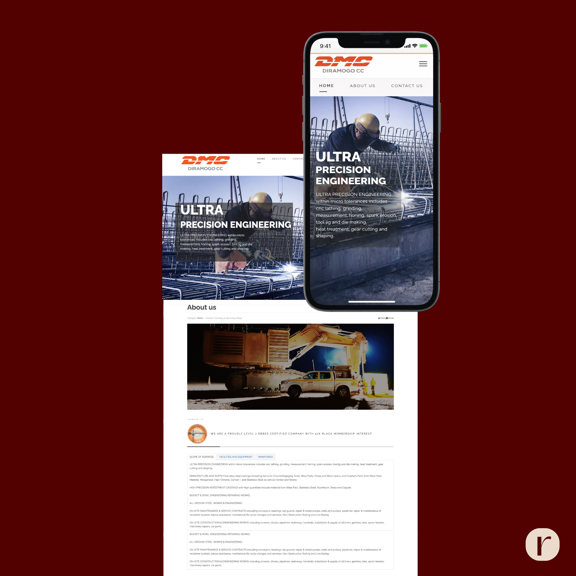
The website also presented limitations. It contained outdated images, minimal information, and very little visual hierarchy. The structure made it difficult for visitors to understand what the company offered or navigate the site easily.
As a result, the brand did not fully communicate the professionalism and capability of the business.
From Outdated to Elevated
Our websites are built for performance, optimised for mobile and structured to rank. Our goal is simple: to ensure your brand is visible, credible and positioned for growth. You deserve to attract the right clients, those who align with your vision and values, and to present your expertise with clarity and authority.
The Strategy
The strategy focused on creating a cohesive brand identity and improving the clarity of communication across all materials.
The approach included:
• refreshing the corporate identity
• simplifying layouts and information structure
• improving visual hierarchy
• introducing consistent brand colours and typography
• creating a more modern and professional presentation
A key focus was making all communication more user-friendly, visually engaging, and easier to navigate.
Brand Identity Refresh
A corporate identity system was developed to ensure consistency across all company materials.
The updated identity included:
• a refreshed colour palette featuring navy blue and bright orange
• modern typography using Roboto and Norwester
• multiple logo variations for different applications
• branded patterns and design elements for consistency
This identity created a stronger and more recognisable brand across both digital and print materials.


Corporate Collateral
Several key marketing materials were redesigned as part of the rebrand.
Email Signatures
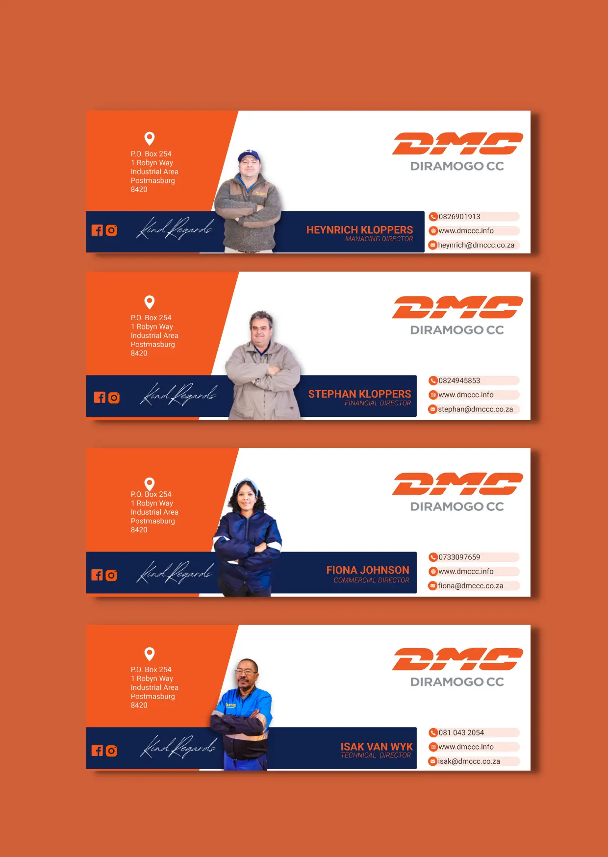
Professional email signatures were designed for the company’s directors as well as a general company signature. This ensures consistent branding across everyday communication
Business Cards
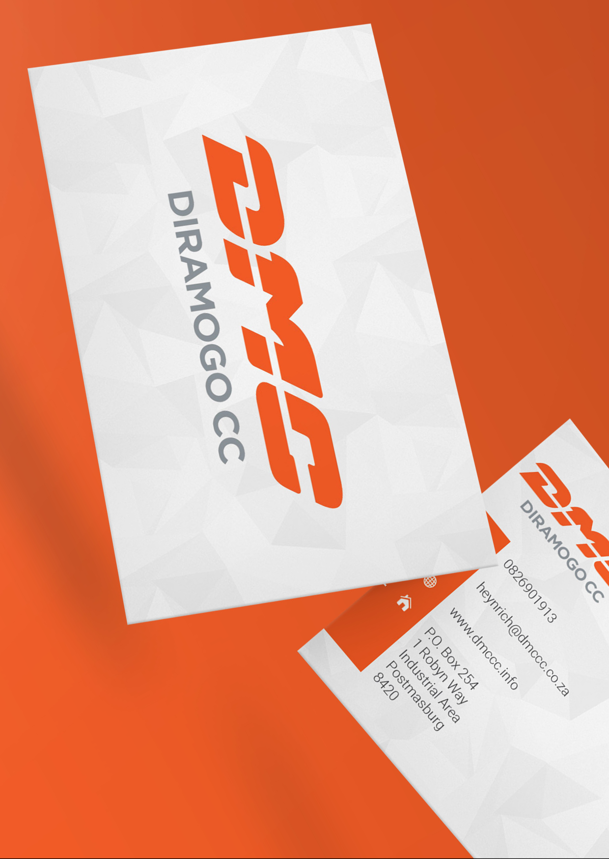
A clean and minimal business card design was introduced for company directors, focusing on clarity, hierarchy, and brand consistency.
Brochure
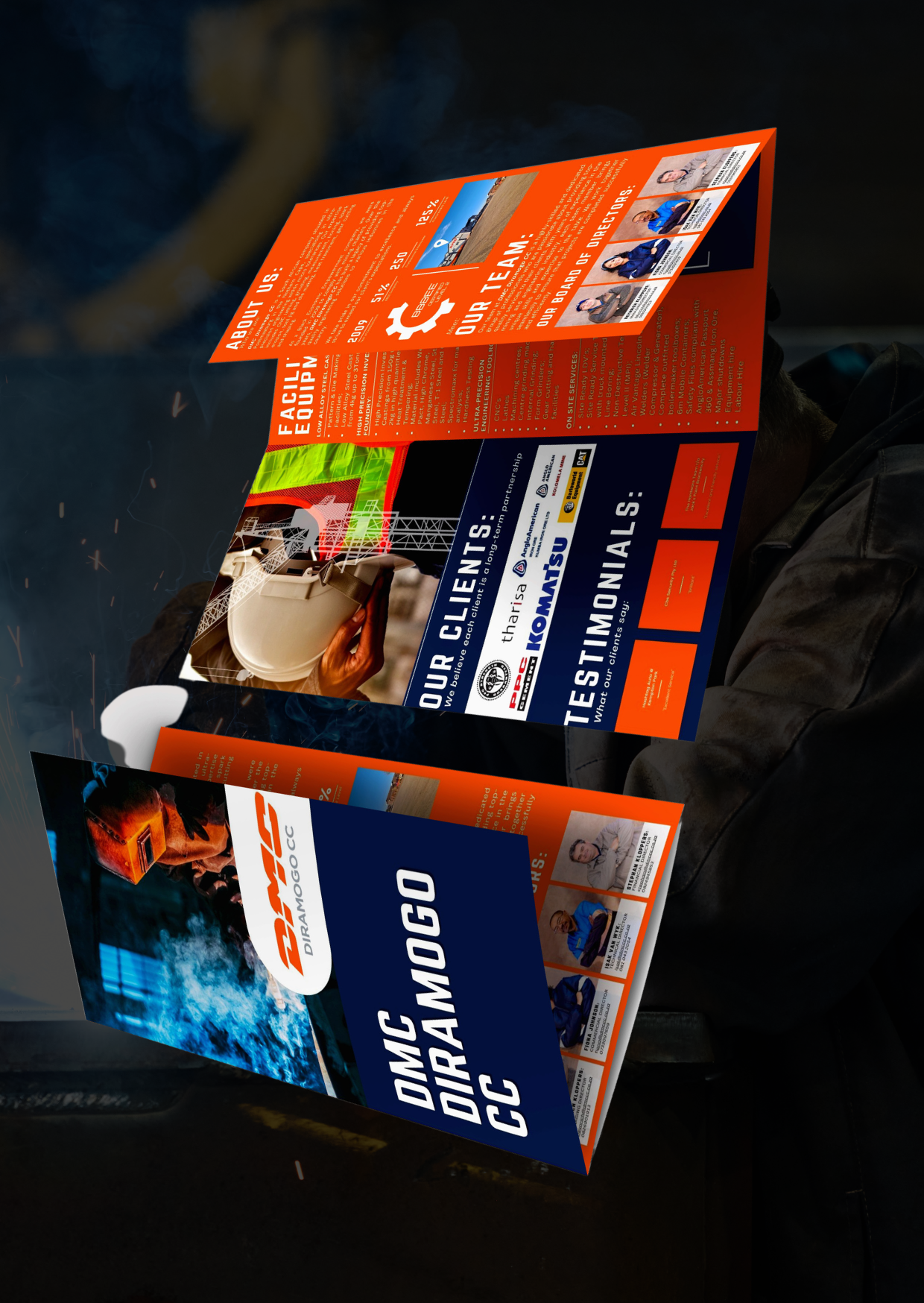
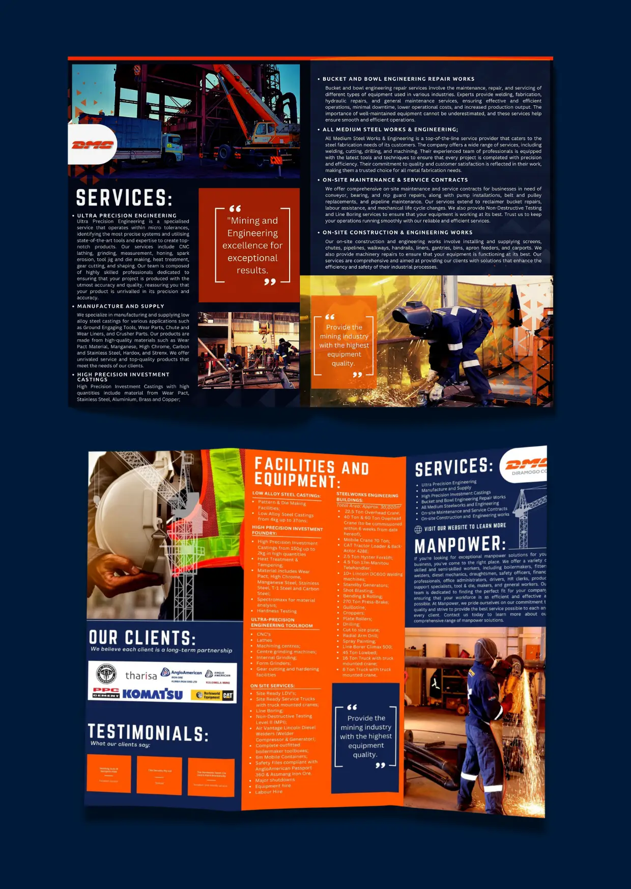
The previous brochure design was extremely busy and difficult to read. The new version focuses on a cleaner layout with structured columns, improved readability, and clear calls to action that guide readers to the website or social media for more information.
Company Profile Redesign
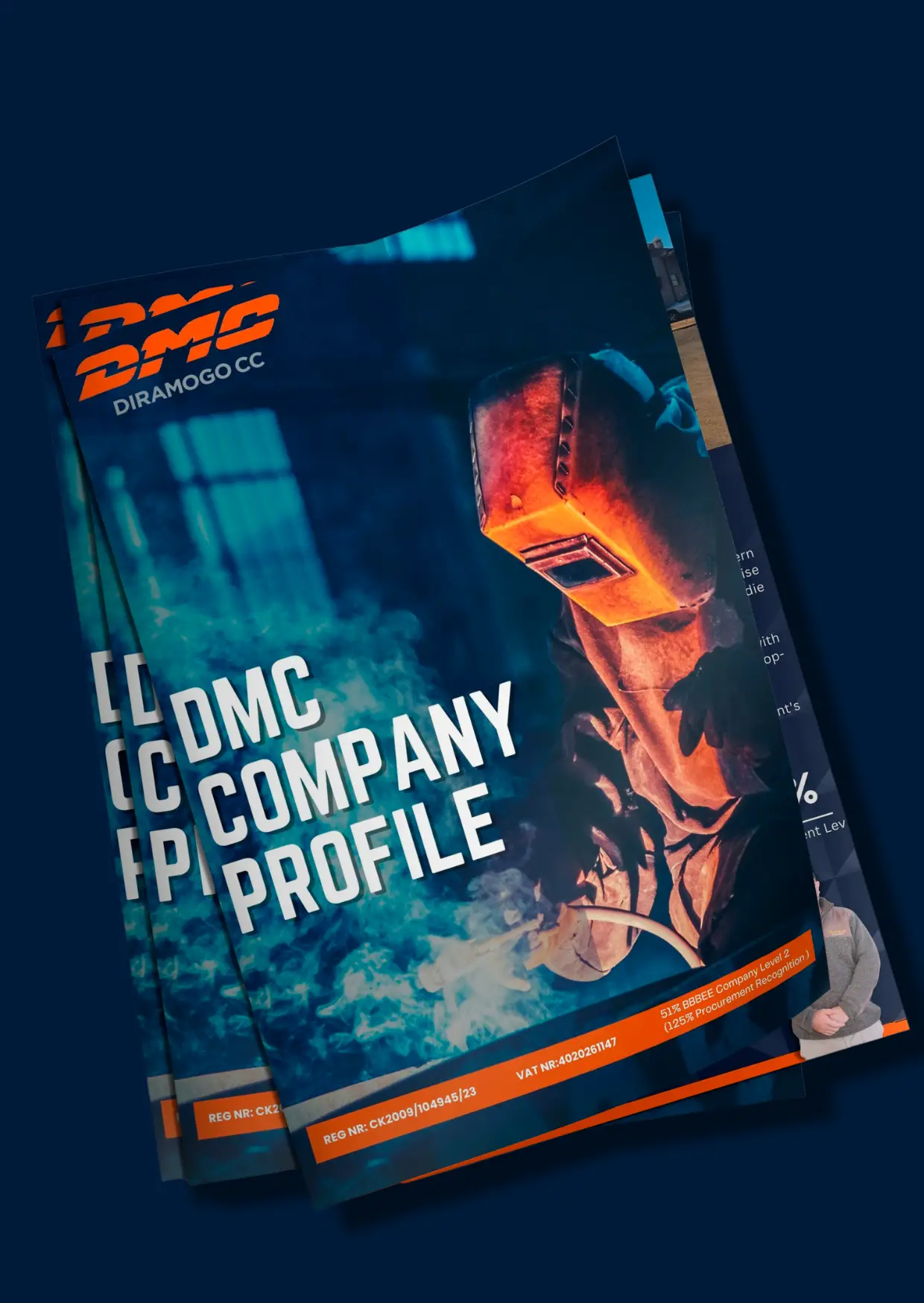
The company profile was completely rewritten and redesigned.
Previously, the document consisted mostly of text with little visual engagement. The redesign introduced:
• structured layouts
• strong visual hierarchy
• photography taken specifically for the brand
• clearer explanations of services and capabilities
The new design uses the updated navy and orange brand colours to create a modern, visually striking presentation.
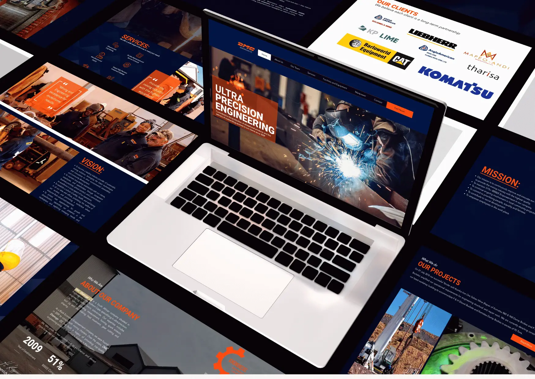
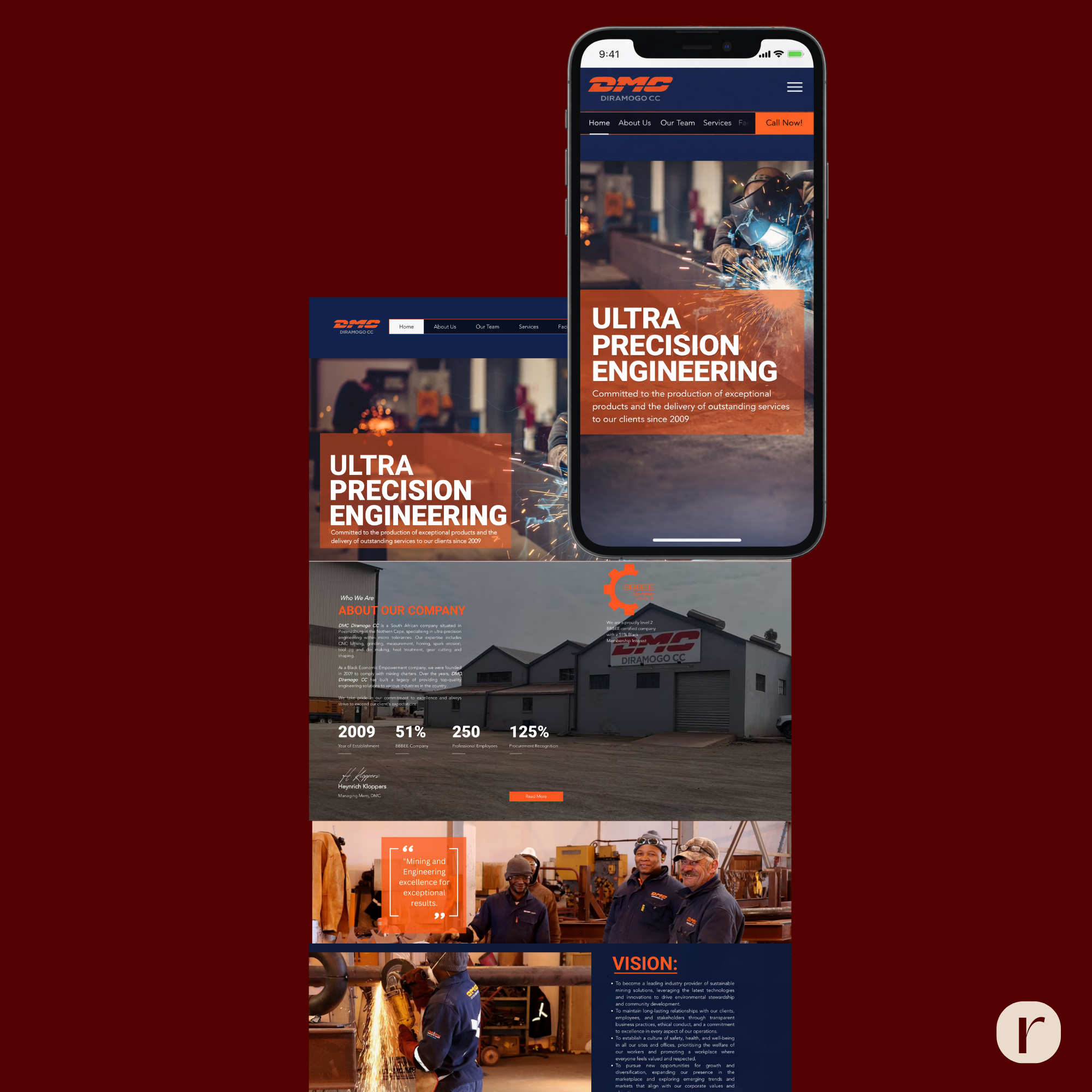
Website Design
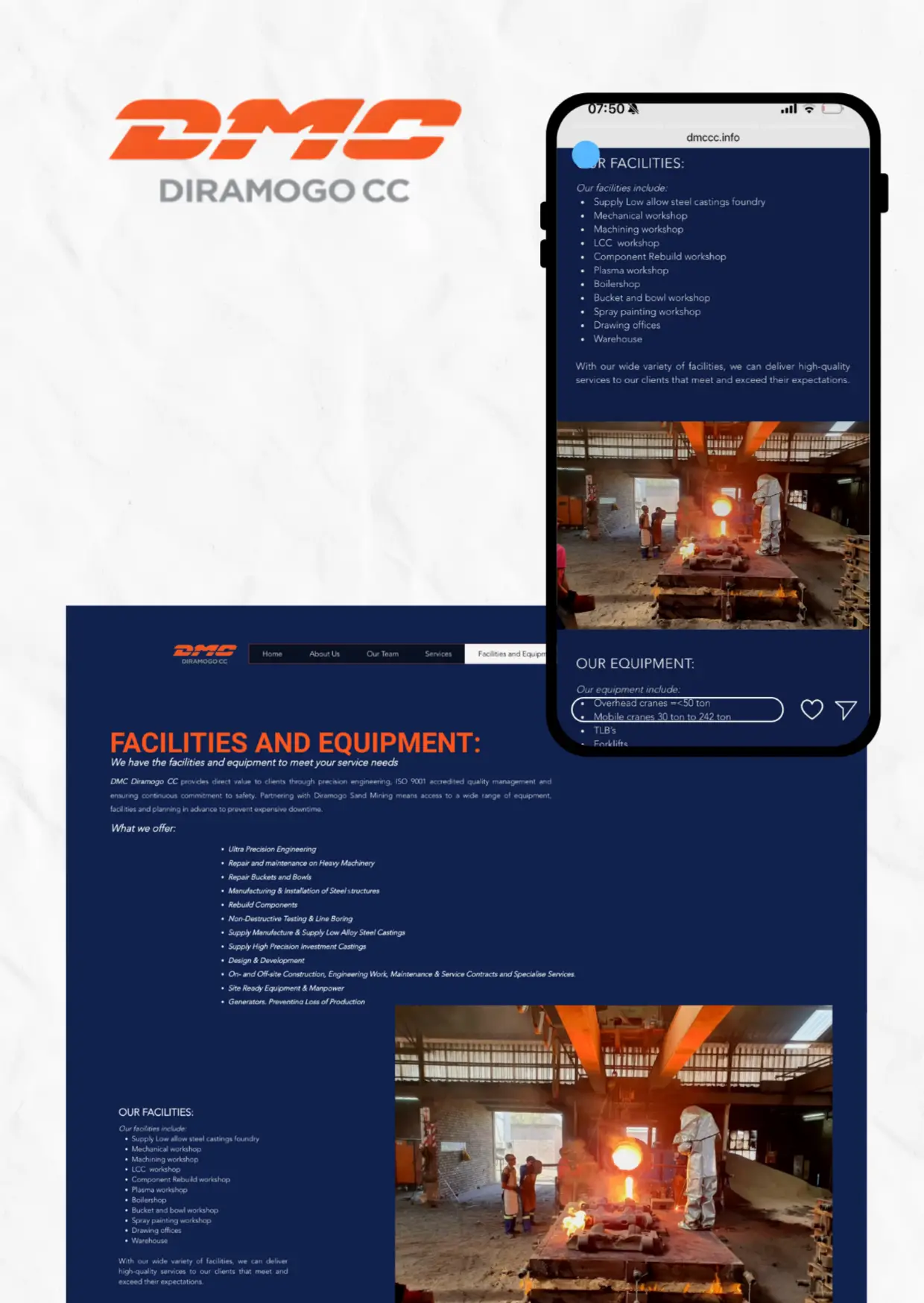
The website was redesigned to better represent the company and provide visitors with clearer information.
The new website focused on:
• stronger visual storytelling
• improved content structure
• mobile-friendly design
• updated imagery
• clearer navigation and service pages
Additional pages were introduced to separate services, facilities, and manpower information, allowing visitors to explore the company’s capabilities in more detail.
The redesign also made the website more personal and authentic by using original photography instead of generic imagery.
The Outcome
The project resulted in a cohesive brand identity and a much stronger online presence.
Key improvements included:
• a modern and consistent visual identity
• improved readability across all documents
• a professional company profile and brochure
• a user-friendly, mobile-responsive website
• clearer communication of the company’s services
The updated materials help position DMC Diramogo CC as a professional, credible engineering partner while making it easier for potential clients to understand the company’s expertise.